Caterpillar Inc., often recognized by its abbreviated name “CAT,” stands as a titan in heavy machinery manufacturing. Globally renowned, the company’s equipment and brand resonate deeply across diverse industries. From diesel and natural gas engines to construction, mining equipment, industrial gas turbines, and diesel-electric locomotives, CAT’s influence is undeniable. Central to this powerful brand identity is the Cat Logo, a symbol that has undergone fascinating transformations, mirroring Caterpillar’s journey of growth, strategic branding adaptations, and unwavering commitment to innovation. The name Caterpillar, or CAT, has indeed become synonymous with robust heavy machinery and unwavering reliability, and the cat logo visually encapsulates these core values.
The legacy of the Caterpillar brand is deeply rooted in the vision of its founders, whose pioneering spirit paved the way for the evolution of the cat logo over nearly a century. To truly appreciate the significance of the cat logo, it’s essential to understand the individuals who laid the foundation for this iconic brand.
The Genesis of Caterpillar
The Caterpillar story began in the early 20th century with two visionary innovators, Benjamin Holt and C. L. Best, whose combined ingenuity sparked the creation of what would become the global powerhouse known as CAT. Holt and Best were pioneers in the nascent field of heavy machinery, venturing into this industry when gas-powered engines and vehicles were still in their developmental stages.
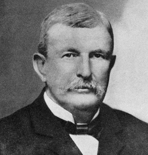 Benjamin Holt, a founder of Caterpillar, revolutionized farm equipment.
Driven by a shared vision of progress and technological advancement, their complementary expertise culminated in the pivotal merger of the Holt Manufacturing Company and the C.L. Best Tractor Company in 1925, giving birth to the Caterpillar Tractor Co. This marked the beginning of Caterpillar’s ascent to industry leadership.
Since its inception, Caterpillar has strategically expanded its operations and diversified its product portfolio, meticulously building a brand that embodies durability, dependability, and relentless innovation. Holt and Best were more than just astute businessmen; they were true visionaries who spearheaded engineering innovations that literally and figuratively paved the way for modern construction and infrastructure development. Their pioneering spirit is intrinsically linked to the enduring appeal of the cat logo.
Benjamin Holt: Innovating for Efficiency
In the late 19th century, Benjamin Holt witnessed the arduous labor faced by farmers and was driven to revolutionize transportation and enhance their productivity. His initial breakthrough was the invention of the steam tractor in 1890. This innovation significantly improved farming efficiency, enabling farmers to work for longer durations and reducing labor costs.
Holt’s most transformative contribution was the development of the first commercially viable continuous tracks for tractors. This groundbreaking invention not only significantly enhanced the performance and functionality of heavy machinery but also inspired the very name “Caterpillar.” These tracks were a crucial advancement, ensuring heavy equipment could operate effectively on challenging terrains such as rough, rocky, or debris-filled landscapes. They also provided superior performance on hills, steep inclines, and soft or sandy ground. The development of continuous tracks exemplified Holt’s dedication to problem-solving, addressing the practical needs of farmers, miners, and construction workers of his era, all of which are values now subtly communicated through the cat logo.
C. L. Best: Enhancing Reliability and Power
Parallel to Holt’s innovations, C. L. Best focused his efforts on refining early gasoline and undercarriage technologies to enhance the reliability of heavy equipment. In the early days of tractor manufacturing, creating powerful machines was only half the battle. These machines needed to be consistently reliable under continuous use in harsh terrains and demanding agricultural tasks.
 C. L. Best focused on improving gasoline and undercarriage technologies for tractors.
Best’s focus on improving gasoline technology was revolutionary. Traditional steam-powered tractors were cumbersome and complex to operate. Best recognized the potential of gasoline as a fuel source and dedicated himself to developing technologies that would enable tractors to start quickly, operate for longer periods, and achieve greater fuel efficiency. This transition marked a turning point, initiating the shift away from steam power and establishing new standards for future tractor designs.
Undercarriage technology was another critical area of focus for Best. Early tractors with simple wheel designs were prone to getting stuck or becoming unstable in muddy or uneven terrain. Best significantly improved undercarriage technology, providing heavy equipment with enhanced traction, better weight distribution, and increased overall stability. This allowed for greater flexibility and usability across a wider range of landscapes. Like Holt, Best’s commitment to technological advancements arose from a growing demand for automation and efficiency in agriculture. His dedication to both power and dependability in tractors resonated deeply with the needs of the time, contributing to the principles that the cat logo represents today. Best’s emphasis on enhancing gasoline and undercarriage technologies led to the development of tractors that were not only powerful but also remarkably reliable, setting new benchmarks in the tractor manufacturing industry.
The Merger: Forging a New Era
Despite leading separate companies, Holt and Best shared a common vision: to create groundbreaking machinery for a rapidly evolving world. This shared ambition ultimately brought them together. The 1925 merger of the C. L. Best Tractor Co. and the Holt Manufacturing Company was a pivotal moment in the history of construction and agricultural machinery. This union formed the Caterpillar Tractor Co., ushering in an era defined by technological progress and industry-leading solutions.
Over the subsequent decades, Caterpillar experienced remarkable growth. The company solidified its reputation by consistently delivering innovative solutions through machines renowned for their durability and reliability. Even today, Caterpillar is characterized by its relentless pursuit of excellence and its adaptability to the ever-changing demands of the global landscape. The core principles envisioned by Holt and Best nearly a century ago remain deeply embedded in Caterpillar’s ethos. Their legacies endure not only in the machines bearing the cat logo but also in the company’s unwavering commitment to its customers and its drive for continuous innovation. Caterpillar’s current global prominence and century-long brand presence in heavy machinery stand as a testament to the visionary leadership of Holt and Best, reflected in every iteration of the cat logo.
A Visual History: Caterpillar Logos Through the Years
The Caterpillar company’s iconic cat logo has undergone an evolution that mirrors its growth and transformation over the decades. The cat logo boasts a rich and dynamic history, reflecting advancements and shifts in the company’s business focus and corporate image. Through its branding and cat logo design, Caterpillar has effectively communicated its core values and brand identity.
Initially, the company primarily focused on tractors and heavy agricultural machinery. Reflecting this focus, the early cat logo designs incorporated elements reminiscent of an actual caterpillar. As the company expanded its product line and diversified its offerings, the cat logo evolved. The creature-like caterpillar was replaced with more abstract representations. This evolution in cat logo design signaled Caterpillar’s broader ambitions, aiming to be recognized not just as a machinery manufacturer but as a brand embodying innovation, resilience, and global reach.
Further cat logo design innovation emerged as the company’s abbreviation, “CAT,” gained widespread recognition and popular usage. This abbreviation was then incorporated into the company’s branding and cat logo design. More recently, Caterpillar introduced a significant branding update for its heavy machinery, incorporating a red hexagon into its trade dress. This logo update was more than a superficial change; it was both a nod to the original graphics used on crawler tractors in 1925 and a clear signal of the company’s renewed emphasis on modernization, premium quality, and commitment to remaining at the cutting edge of technology and innovation.
Much like the company it represents, the Caterpillar cat logo has undergone several transformations since the company’s founding in 1925. The brand’s identity and cat logo have consistently reflected its growth, dedication to innovation, and responsiveness to the evolving needs of customers worldwide. Let’s delve deeper into the Caterpillar cat logo design evolution across the years.
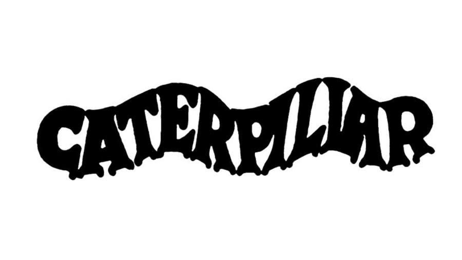 Caterpillar's original logo from 1925 to 1931 featured a wavy design symbolizing tractor tracks.
Original Logo Design (1925-1931)
The original cat logo from 1925 featured a stylized depiction of a caterpillar, aligning with the company name. The wavy design is also interpreted as symbolizing tractor tracks, underscoring the company’s initial focus on heavy machinery and tractors. The text style employed a traditional serif or sans-serif typeface. The design was produced in two color variations: black on a white background and red on a gray background. This initial cat logo was simple and directly emphasized the brand name, reflecting a straightforward branding approach and a focus on establishing brand recognition.
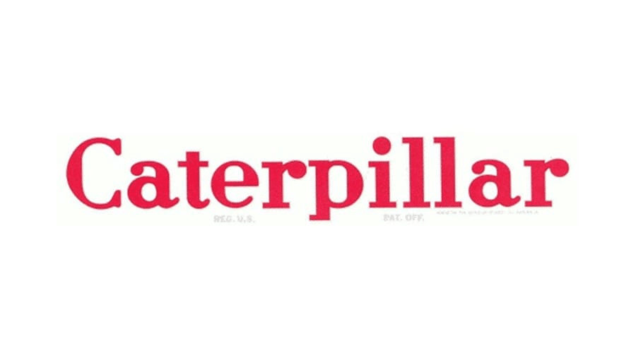 Caterpillar's logo revision from 1931 to 1939 featured a rounded serif typeface in red.
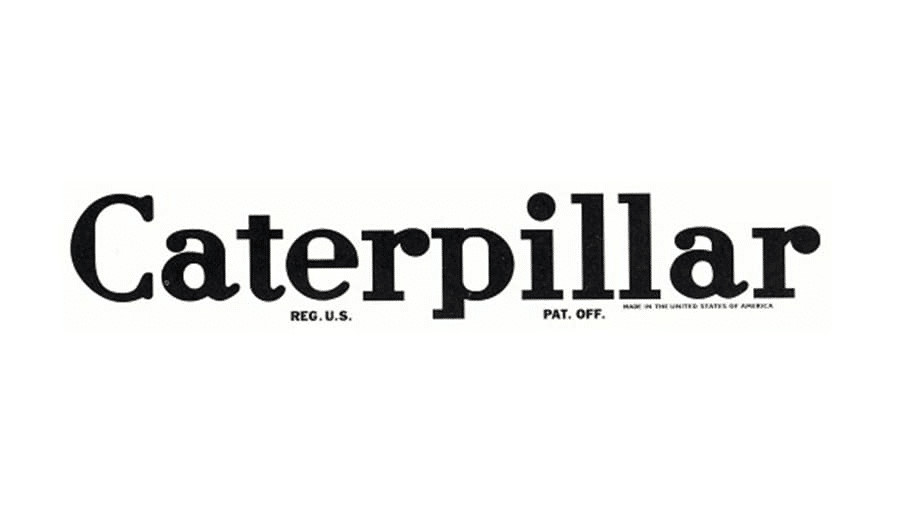
Rapid Revision (1931-1939)
The undulating caterpillar cat logo quickly evolved into a redesigned wordmark of the company name. In 1931, the typeface was changed to a rounded serif in red, with details below (patent registration and manufacturer location) in gray. This more traditional design resonated with the aesthetic of the Depression era, while the red-on-white color scheme conveyed the energy and ambition of a burgeoning business dedicated to delivering quality products. In 1932, the color of the wordmark and detail was changed to black, and this version of the cat logo remained in use until 1939.
 Caterpillar's logo from 1939 to 1941 introduced subtle changes to the lettering shape.
Minor Revisions (1939-1941)
Subtle adjustments to the shape of the lettering in the Caterpillar wordmark were introduced in 1939. The detail below the wordmark also abbreviated the manufacturer’s location to “U.S.A.” These minor revisions maintained the established cat logo identity while refining its visual presentation.
 Caterpillar's logo from 1941 to 1957 widened the letter spacing for enhanced readability.
Added Space (1941-1957)
The most notable change in the 1941 cat logo was a narrowing of the typeface within the same overall width as prior designs. This resulted in increased spacing between letters in the company name, enhancing readability and giving the cat logo a more open and modern feel for the time.
 Caterpillar's logo from 1957 to 1967 adopted a bold sans-serif typeface for a modern look.
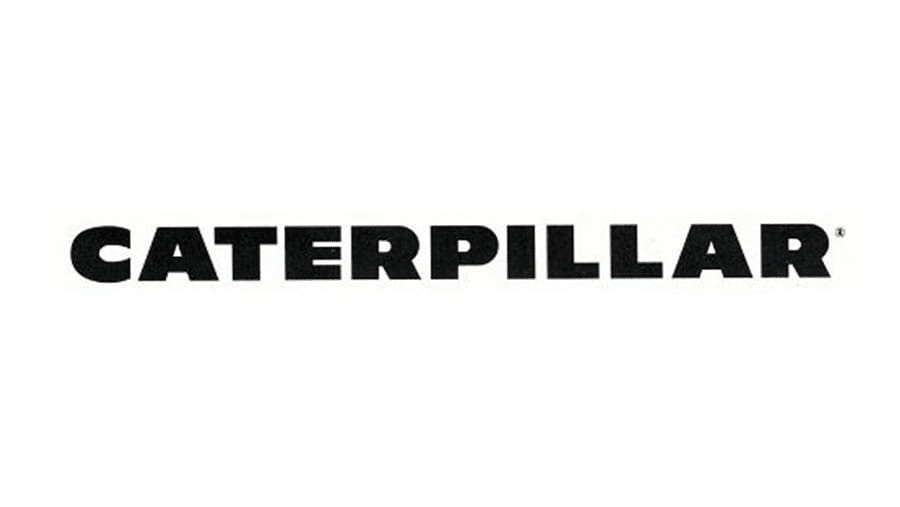
A New Look (1957-1967)
The Caterpillar cat logo underwent a significant transformation in 1957. As the company adapted to changing times and a more evolved brand identity, a new cat logo was needed. The all-caps inscription in an extra-bold sans-serif typeface was robust and commanding, projecting growth and modernization.
 Caterpillar's logo from 1957 to 1967 featured a bold, modern sans-serif typeface.
The adoption of an extra-bold font in the cat logo can be seen as a visual representation of the company’s expanding influence within its industry. This shift from the logos of previous eras signaled a company growing in market confidence, aiming to convey a message of strength and unwavering reliability through its cat logo.
 Caterpillar's logo from 1967 to 1989 introduced a stylized 'C' emblem.
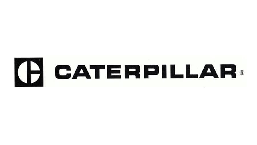
Stylized “C” (1967-1989)
This period in the brand’s history marked the introduction of an emblem to the left of the Caterpillar wordmark, becoming an integral part of the cat logo. The wordmark remained all-caps but transitioned to a thinner, yet still bold, sans-serif typeface. The new emblem was a monochrome square featuring intersecting lines that divided a white circle, creating a stylized “C.” This added emblem visually represented a period of prosperity and significant growth for the company, further enriching the cat logo’s symbolism.
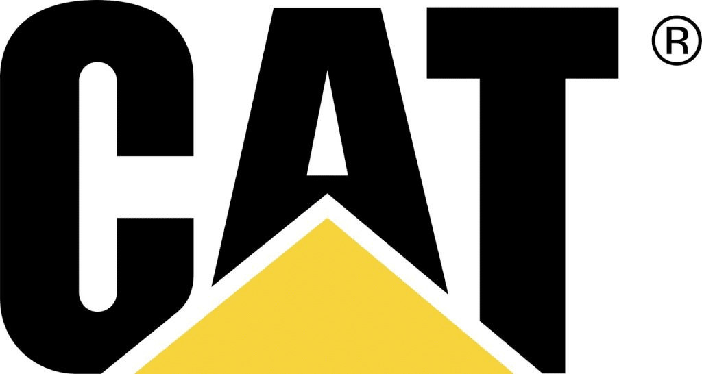
Yellow Triangle (1989-Present)
Modern iterations of the Caterpillar cat logo incorporated a yellow triangle, primarily decorative but adding a distinctive and vibrant element. The wordmark is again set in all-caps, but this time in a taller and rounder sans-serif typeface. The yellow triangle is positioned in front of the word “CAT,” further emphasizing the brand’s abbreviated identity within the cat logo.
 Caterpillar's current logo features a yellow triangle, symbolizing stability and progress.
Abbreviated CAT Logo
The company’s abbreviation, “CAT,” is now deeply associated with the brand and has been prominently incorporated into the cat logo design. This iteration features the first three letters of the brand in a strong, bold typeface, positioned behind the eye-catching yellow triangle. The yellow triangle in the cat logo can be interpreted as a symbol of stability and upward progress, reflecting the company’s commitment to advancement and its solid foundation within the industry. The abbreviation ‘CAT’ in the cat logo makes the brand more approachable and instantly recognizable.
New Trade Dress
Most recently, Caterpillar transitioned from the “Power Edge” trade dress to a new design, “Cat Modern Hex.” While both designs include the Cat trademark and product model name, the new “Cat Modern Hex” design introduces a bold red hexagon and grille pattern, all rendered in 3D. This design and color choice for the cat logo and trade dress pays homage to the graphics used on Caterpillar’s earliest crawler tractors produced in 1925, effectively blending heritage with modern branding.
A Legacy Forged in Branding
The evolution of the Caterpillar cat logo stands as a powerful testament to the company’s adaptability, growth, and deep understanding of the critical role of branding. Each iteration of the cat logo design reflected the specific era in which it was developed, mirroring both the company’s internal advancements and external shifts in design aesthetics and customer expectations.
 Caterpillar's logo evolution reflects nearly a century of experience and innovation in branding.
Caterpillar’s legacy is built upon nearly a century of experience and continuous innovation. The company has come a long way since its early days with Holt and Best. Each decade has presented new challenges, and Caterpillar has consistently met these challenges by adapting, evolving, and setting new benchmarks in the industry. This adaptability is evident not only in their machinery but also in their strategic branding and cat logo design.
The cat logo’s evolution is compelling evidence of Caterpillar’s enduring ability to remain relevant and resonate with its customers across decades. Caterpillar’s journey from its inception to its current global market leadership is a narrative of unwavering commitment, relentless innovation, and strategic development, all visually chronicled through the transformations of its iconic cat logo. From the literal caterpillar in its early days to the modern red hexagon of its latest trade dress, the cat logo tells the ongoing story of a brand that is perpetually evolving while remaining deeply rooted in its core values and rich legacy.